Bureaucratic and human aesthetics
Governments should ask the public to co-produce more of its art
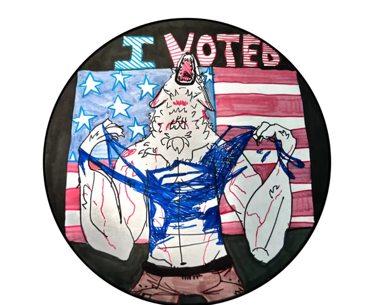
My new home state of Michigan decided to add a little more variety to the ubiquitous “I voted” stickers that define election season. The results were pretty terrific. This one from 12-year old Jane Hynous got the most votes:
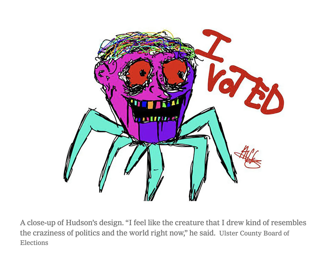
The competition was modeled on a similar effort by Ulster County, in New York. Here, the winner was another untraditional option, designed by a 14 year old Hudson.
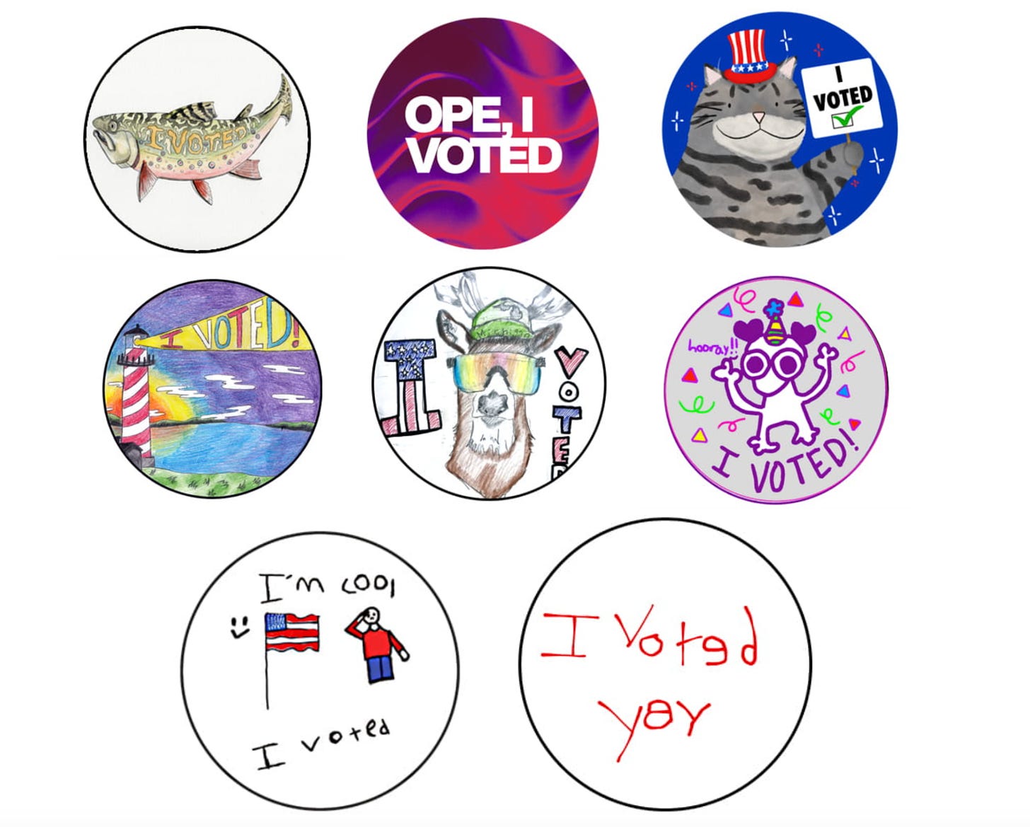
In Ulster, Hudson’s design was placed on he stickers. In Michigan, local officials placed Jane’s wolf sticker, along with others winners (see below) on a million stickers distributed to local officials, who could order more. The competition allowed people of different ages to submit, so many of the entries are from a younger generation.
As someone who studies government, this seems wonderful to me. Such competitions allow the incorporation of more human aesthetics into public spaces. Think about the the traditional bureaucratic process of doing this. A government official commissions an artist or an ad firm, with the results reviewed by a committee. A variety of criteria, some explicit and some implicit, follow. It should be patriotic. Maybe have the flag. It can’t be weird. Should look polished and professional. The end result often ends up being banal. The bureaucratic aesthetic tends towards dullness.
This is not always the case. The New Deal and World War II were a golden age for government-produced art, in large part because the government just employed artists then. That is not the case now.
The internet has also allowed a democratization of such processes. People can submit materials online, and can view and vote for their favorites. And people, it turns out, don’t like banal flag-based backgrounds. They like slightly quirky, funny or even downright odd images. The human aesthetic, of public representations at least, tends towards weird. The good type of weird: playful, surprising, and humorous; not the bad type of weird, which assumes to harangue people about their personal lives.
Asking the public to name things has a less stellar record. People take the opportunity to pick the most bizarre option possible as a way of mocking the seriousness of the whole thing. The British public voted to name a polar research ship Boaty McBoatface. Social media campaigns can fuel such choices. The Slovakian public wanted to christen a bridge after Chuck Norris. The residents of Austin, Texas voted to name a waste disposal unit after Limp Bizkit frontman, Fred Durst. In all three cases, the public wishes were overturned by the governments who could not countenance such frivolity.
One difference between naming things and art contests is that people have to actually make something in the art contest. And it is less easy to sustain a theme of pure mockery when you are making something, or evaluating the art of another. At some level, you have to actually feel a sincere connection. The Chief of Staff of the Michigan AFL-CIO posted: “If there is ever a year to have an unhinged werewolf ripping its shirt off as the “I Voted” sticker … it’s 2024,” who also said he lobbied his local election clerk to adopt it. The winning entries just sort of grab you, or make you smile.
Here, the idea of co-production is helpful. This implies that public goods or services are co-created by members of the public, not just created by government or its contractors. That involvement makes it more likely that the public will be engaged, see themselves in the outcome of the process, and support the outcome.
Flag competitions are another obvious place to invite the public. In 2023, Minnesota chose a new flag after a public competition. Although it is worth noting that the final design (below)…
….drew inspiration from rather than actually copied the winning entry (below).
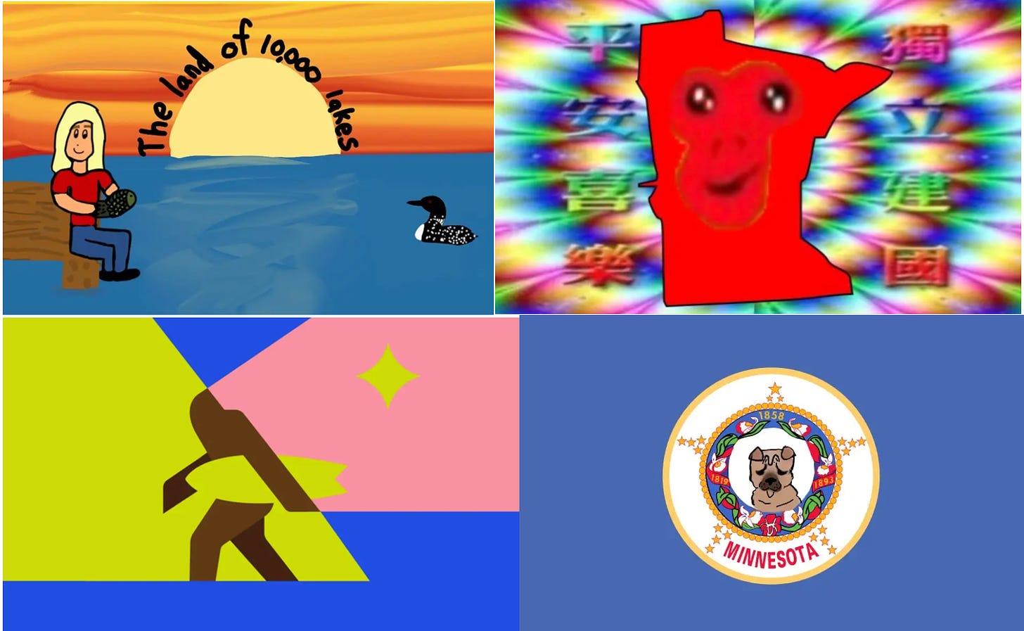
Below are four of the more imaginative entries that did not make the cut.
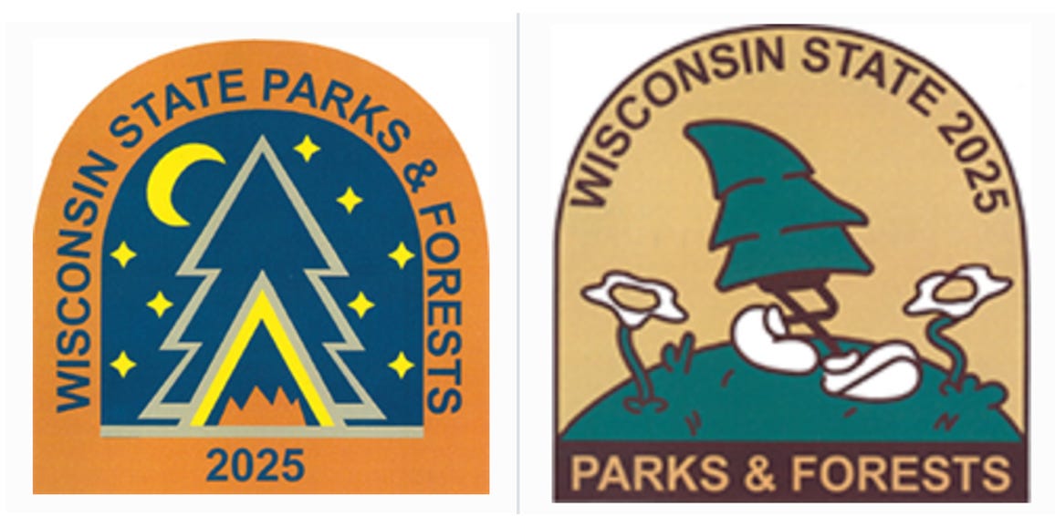
There are other examples. Wisconsin invites high school students to submit images for vehicle admission stickers for parks. The winner is on the left, but I sort of prefer the runner-up on the right.
My priors are that it it would be better to a) get more public involvement in artistic choices made by governments and b) governments should not do this unless they are willing to commit to it. The willingness to make public commitments (“the public can name our new boat”) and then reverse them (“but not Boaty McBoatface”) implies that governments do not always think through some of the values they care about ahead of time when seeking to democratize such processes. In the case of Boaty, the British government did ultimately grant a small submersible the honorific by way of compromise.
Thus we might think about two ways the government can engage with human aesthetics.
Allow more public involvement in formal representations
Lets imagine one scenario where the government is unwilling to surrender to the wisdom of crowds when it comes final decisions. Governments are not going to give up control of the design of something that is permanent and consequential. This includes the names of buildings or flags, seals or logos. We might think of the condition of permanent and consequential as invoking a quality of formalism, which public officials will see as as necessarily governed by bureaucratic aesthetics — conveying tradition, dignity, understatement, and respect.
In this scenario, the government can still involve the public in making decisions, but structure the choices that people vote on, creating categories and criteria, and excluding that which would reasonably be assumed to be offensive to many. They can use committees, rather than popular vote, either to select winners or narrow down the finalists.
They can also invite submissions from the public. Some of this already occurs. There is an annual federal duck stamp contest, where artists can compete to see their work placed on a stamp (this was a minor plot piece in the movie Fargo - Marge’s husband placed second). NIH has created public competitions to generate art that raise awareness about rare diseases.
Having a committee or expert filter to control the process clearly moves the outcome toward bureaucratic logic. Only a skilled artist will win the federal duck contest. Wacky art installations are unlikely to win over a committee that includes serious artists. But such processes may still leave room for human atheistic. It is hard to imagine that the design of the undergraduate student Maya Lin would have been selected to for the Vietnam Memorial if the process had not included a public competition. As it was, the minimalist design drew so much opposition — partly because Lin was Asian, partly because it was perceived as defeatist — that the Reagan administration delayed building it. The memorial grew in popularity precisely because it was not a traditional war memorial. Family members could walk right up to it, touch it, take an rubbing of the name of their loved on on a piece of paper, or leave a memento. The space reflected human aesthetics of accessibility, engagement and touch rather than a government tradition favoring statuary grandness. In that respect, the Vietnam memorial has something in common with the vulpine voting sticker. It is designed for people to engage with as humans in a stance other than that of awed and obedient citizen.
Expand informal representations that are ideal for human aesthetics
Voting stickers, or annual parking sticker passes are the opposite of permanent and consequential. They are temporary. They do not occupy some grand space. They can be informal. Which means, it matters less if they are incorporate more human aesthetics — informal, irreverent, tactile, or fun. Posters, stickers, license plates, murals, leaflets, logos, website images, and library cards are other venues that allow for informal representations. License plates, in particular, because they allow for choice, can provide more variety.
The dividing line between what is formal and informal as I have presented them here is entirely blurry. One agency leader might decide they are open to adopting a more provocative logo than another. Tastes also vary and evolve over time; what was irreverent in one generation can become staid for another.
My suggestion here is that governments can create more and more opportunities for visual representations in low-stakes and informal ways and use that as a means to engage public participation. Someone, maybe even a student intern, should be running around looking for ways to invite the public in to reclaim some visual space of government. The participation itself has value — there is a reason that many of these competition target students, which is that engaging in participating requires some civic learning about the purpose of that engagement. Such opportunities also serve to humanize public spaces, events, processes or organizations, injecting them with the texture of humans rather than that of bureaucracies.
I’m going to leave the comments open on this post, hoping folks will share other examples or suggestions about how to better embed human aesthestics into public spaces.





I am a fan of graffiti art. Decriminalizing the act and providing walls or art spaces to graffiti writers is an excellent way to learn about the feelings of and happenings in communities. Yes, I know not everyone appreciates this art form. If it is directed with permissions & including entire communities in their production is also a way to bring people together and create deeper understandings of what is important to all concerned.
I have to admit when I first read about Boaty McBoatface I thought it was funny, but not real. When I found out that it was real I was thrilled. I agree with your points about involving artists and other citizens to create visual images because it is a great way to humanize government. I also agree with using more murals on public buildings, graffiti and Banksy type artists, and more public voting on how public buildings should look as mentioned in other posts. Some things have to be standardized for the sake of safety (street signs, street lights, road lanes, poison markers, etc.) but even then, some color and originality should also be used. Let's bring joy into these things as much as possible, and a bit of whimsy.